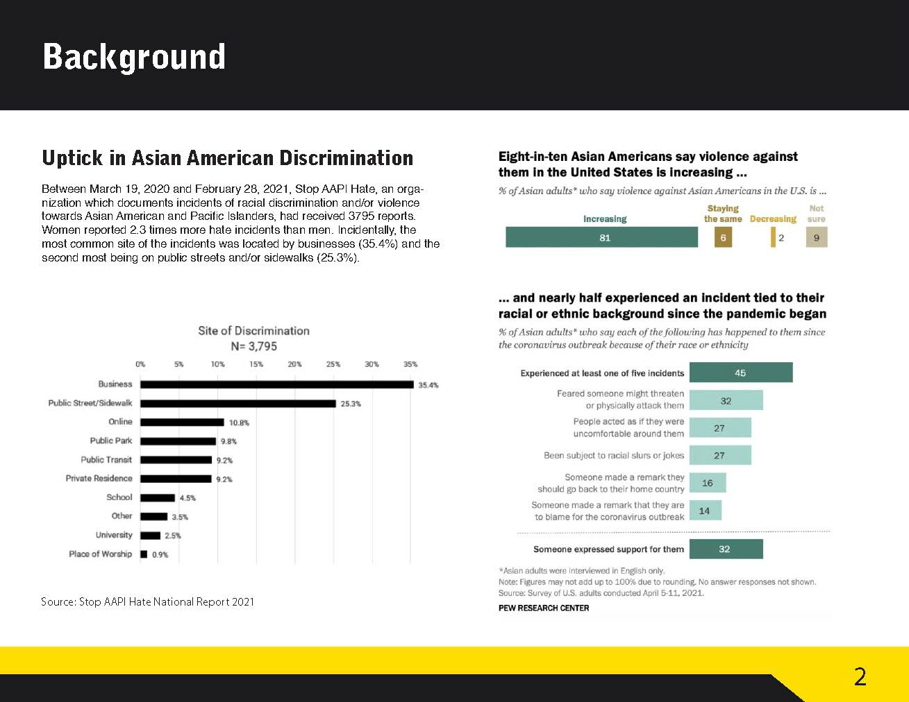
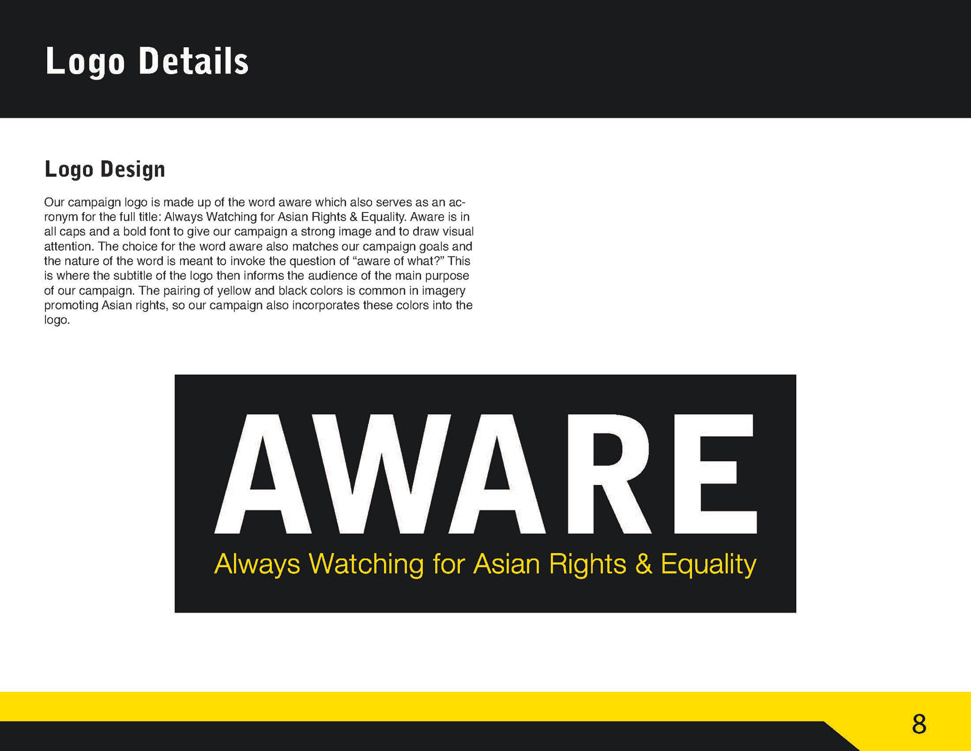
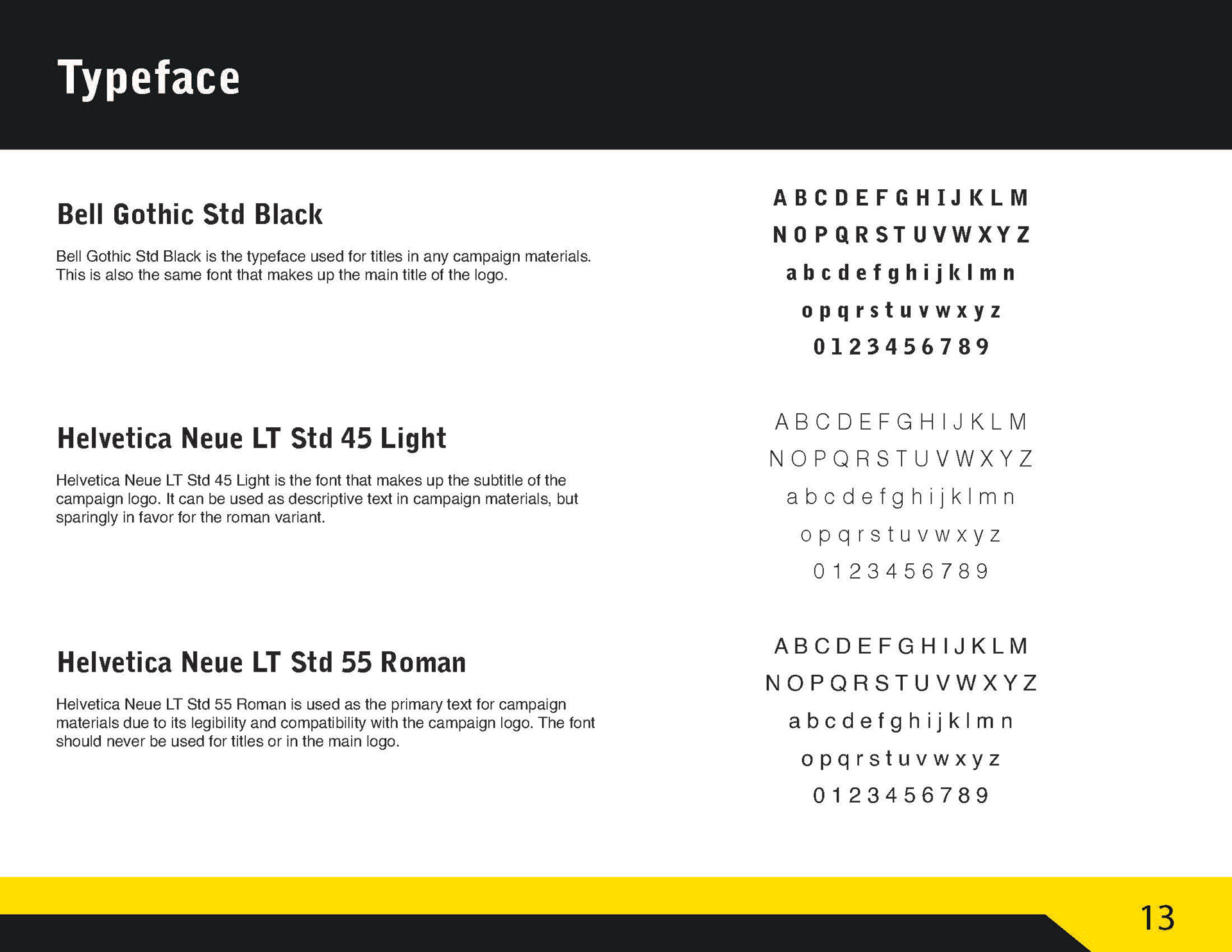
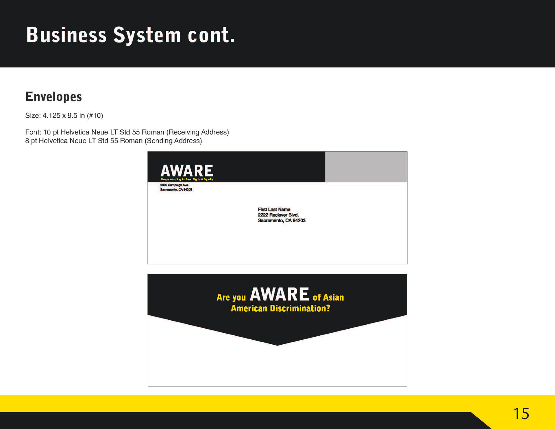
Serena Tieu
  • Project Gallery
  • Experience/CV
  • Press
  • More
    • Project Gallery
    • Experience/CV
    • Press
Serena Tieu
  • Project Gallery
  • Experience/CV
  • Press

About AWARE

AWARE (which is an acronym for Always Watching for Asian Rights & Equality) is a campaign that was designed in response to the anti-Asian hate crimes that arose during the COVID-19 pandemic. AWARE is a nonprofit organization that is responsible for the community-watch system that specifically happens in the business areas of Sacramento, CA, which had one of the highest reports of anti-Asian hate crimes in the country. Participating businesses would receive official partnership stickers to put on their business windows, and safeguard vests for workers to wear so that people can identify them as workers who will take action whenever they see racial abuse or harassment happening to someone inside or nearby their business.  

Table of Contents

1. Editorial

2.a) Website Mockup: Desktop Version

2.b) Website Mockup: Mobile Version

3. Harassment Postcard

4. Informational AWARE Brochure

5. Merchandise Mockup Designs


My Team

Working on this campaign was a lot of work, but it was very fun to put together. My teammates, William Chen, Jacky Kuo, and Ulysses Tu, split the work among ourselves and worked on this campaign for three months. William was responsible for the logo design, letterhead, graphic standard, and the business system. Jacky was in charge of creating the merchandise mock-up designs and the Twitter website mock-up. Ulysses designed all the posters and banners.  I designed the website mock-up (both the desktop version and the mobile version), the Harassment Postcard. and the official AWARE Brochure. I also helped Jacky with some billboard ideas and merchandise ideas. I also calculated the estimated annual budget cost of the campaign, and I researched possible grants that our campaign could be applied for further backing.   NOTE: Because this is my portfolio, I will only display the work that I did. If you would like to see the rest of the campaign work and have a complete explanation of how the entire campaign came together, please contact me!

Special Thanks

Most of the images were stock photography downloaded from Pexels.com, but I took some pictures of my own using my roommates, Ariel Hilomen and Jane Tai, as models. My original stock photographs that featured my roommates (the two young women who wore a vertically striped blouse and a black T-shirt, respectively) were taken with my Nikon 3400. 

The Name & the Logo

William designed the name and logo. All of us agreed that the primary color palette to include dark gray, yellow, and white; and the secondary color we could use with merchandising was red. The design of the logo was meant to be boldly eye-catching and thought-provoking in the way that would make the viewer wonder what the name stands for and our summarized purpose as an organization. This logo, with its black background, would be the official sticker that store owners would place onto their store windows to let people know that their establishment pledges to keep an eye out for the protection and safety of Asian people. 


Throughout the entire campaign, I thought to include as many different types of Asian people, both multigenerational and multiethnic, in the visual graphics for the most well-rounded representation.

Editorial

I also designed an editorial layout using InDesign inspired by the National Post. I chose red as the primary design color because red has many Asian cultural ties to the color. The font I chose was Minion Pro. 

My team and I wrote the content together after compiling individual research related to the social issue about anti-Asian racism. My team and I compiled the best photos we could find on Google Images to use in our editorial designs.

Although this section of the article we wrote was meant to be a sidebar section, I decided to dedicate an entire page to it to make learning about taking action distinctively different than the rest of the article. I made the entire page orange to make it stand out from the other pages and to match the color of the infographic. The entire page is orange and has its own advice content to also serve as a break from reading the educational news article.

The last page was designed to just focus on the concluding section and include the sources, which was  definitely a challenge organize and fit on the last page due to the chunky amount of words and hyperlinks that I needed to include. 

Website Mockup (Desktop version)

The Homepage

This is the homepage of the website, www.WeAreAware.org. The website can be ideally accessed via desktops or mobile devices. Our QR code would link you directly to the mobile version of the website, while the desktop version can be accessed by typing in the URL. The website is meant to be widely accessible through multiple language translations. 


The Homepage is the landing page of the website, but it can also be revisted by clicking the "Home" tab of the sidebar menu or by clicking on the logo up at the top-left corner on every page of the website.

The About Page

While on the homepage, site visitors can scroll down to read our mission statement. The page can be continuously scrolled down to see the Sign-Up Page below.

How It Works and Sign Up Page

This page is split into two side-by-side sections: the "How it Works" section, and the "Sign Up" section. We want to ensure that people who sign up for our campaign are well-informed with how the campaign works by reading the "How it Works" section, how to identify racial abuse, and what to do upon witnessing racial abuse (both should be done by reading articles on the Information Page). This page can be accessed either by clicking the "Information" tab of the sidebar, by clicking "Click here to find out how our campaign works" on the "About" page, or by finding in the website's search results.

The Information Page

This Information Page features article headlines on a blog-styled layout that link to separate pages of their respective articles. The images are also clickable.  This page can be accessed only by clicking the "Information" tab on the sidebar menu and in the website's search results.

Sample Article Page

This is a sample article page, which can be accessed by clicking on any article link on the Information Page, or be found in the website's search results. 

The Merchandise Page

The Merchandise Page features a small selection of items that both participating business and the general public can buy.  This page can be accessed only by clicking the "Merchandise" tab of the sidebar menu. Upon clicking, the Merchandise Page will pop up in a separate new tab. The Merchandise Page also has a cart button on the side and its own search bar that is separate from the website's search tool. If the user were to click on the cart bubble, they would be directed to their cart and then be able to check out. The search tool on the Merchandise Page is specifically used to find specific items through tags and item names.

Making Hate Crime Reports through the Website

Although our website and campaign is mainly targeted at business owners, we want anyone to be able to use our website as a resource to become educated on how to identify, stop, and report racial harassment.  We understand that some ethnic Asian groups have negative ties to the police, so reporting to the police can sometimes put the victim at further danger than good. That is why we are not directly affiliated with the police. The website explicitly states that they should go directly to the police if they want the police to get involved. The data we collect on our website will only be used for educational purposes and in court cases.  By letting our audience know that their reports can be anonymous (if chosen to be reported anonymously) and that we are not affiliated with the police, people will be less likely to be afraid to speak up about their experiences.  This page can be accessed only by clicking the "Report" tab of the sidebar menu.

Website Mockup (mobile Version)

Homepage

"How it Works" Page

About Page

This is the landing page when a user opens the mobile browser. Users can access the website in different languages that would be translated by actual native-speakers on our team instead of relying on the faulty Google Translate.

About Page

"How it Works" Page

About Page

The mobile version of the website is pretty much identical to how users can move around on the desktop version, except the texts and images are sized down, and there is infinite scrolling on the mobile version.

"How it Works" Page

"How it Works" Page

"How it Works" Page

If users cannot read the text properly due to size issues the user can always zoom in on their mobile bowser.

Sign-up Page

Sample Page of an Article

"How it Works" Page

After learning how the campaign works, users can decide to sign up to participate in our campaign and even fill out an application to sign up on the mobile version of the site. This mobile accessibility is nifty for users if they ever catch inspiration to help out.

Information Page

Sample Page of an Article

Sample Page of an Article

People can still read articles on the mobile version as they wait on a subway, bus, or anywhere.

Sample Page of an Article

Sample Page of an Article

Sample Page of an Article

Articles can be scrolled all the way to the bottom.

Report Page

Hamburger Sidebar Menu

Merchandise Page

Users being able to make reports while they are out with their mobile devices will come in handy when they stumble upon anti-Asian hate crimes in public.

Merchandise Page

Hamburger Sidebar Menu

Merchandise Page

Similar to the desktop version, users can shop on the mobile version and scroll down to see the selection of merchandise we have in stock. Users can also see different color variations of merchandise simply through tapping the color swatch to sneak a preview.

Hamburger Sidebar Menu

Hamburger Sidebar Menu

Hamburger Sidebar Menu

The hamburger sidebar menu is great for navigating this medium-sized website that is packed with information. This can be minimized to resume browsing the original page the user was previously browsing simply by tapping the hamburger icon again.

Harassment Postcard

The front cover of this educational postcard calls the audience to action. The postcard is meant to be handed out as a pamphlet, or picked up on the desks and cashier counters anywhere in Sacramento. 

The backside of the postcard contains printed information on how to identify racial abuse, definitions and types of racial abuse, and what to do upon seeing someone being racially abused. This exact educational text can be found on an article on the Information Page of the website.

Informational AWARE Brochure

On the Outside of the Informational AWARE Brochure

This is the cover of the brochure. The brochure is a tri-folded 8.5" by 11" print that is meant to inform people of what AWARE is and how the campaign works. The thought process of making this brochure was: "The outside is supposed to warn readers before they tread any further in reading about the campaign details. Readers should check out the legal associations and restraints before considering to become an active member of AWARE." 


"Let's rebuild our community together" is a very meaningful tagline that I came up with for the brochure cover. Not only does it make for a complementary caption for the image of the handholding Filipino couple, but it also builds on a bigger picture of bridging the Asian Pacific Islander community and the Asian community with all the rest of the world.

Representation Matters

I found this image of an old Filipino couple on Pexels, but I turned it into a black-and-white, monotone image on Photoshop to better match the black-yellow-and-white color scheme. I really liked using this photo because it represents the elderly, Asian Pacific Islander ethnic group, which is usually not seen as a "mainland," stereotypical Asian group by most Americans. Spreading the representation in our campaign brings equality to all Asians and Asian Pacific Islanders. I want people to know that Asian Pacific Islanders also deserve to be just as happy and recognized like everyone else.

On the Inside of the Informational AWARE Brochure

This brochure is meant to be straightforward in explaining what happens after a user signs up to participate in the campaign. This brochure is also meant to be handed out or stand with other brochures in institutions like the library, or the office.

Reinforce the Campaign Slogan

It's very important to remind people to not be bystanders. THat is why our slogan is posted everywhere throughout the campaign. Although the slogan is grammatically incorrect, this "error" is actually intentional to make people really think about what this means. This slogan is meant to be memorable and promote the idea that people need to take action to create positive social change.

MERCHANDISE

AWARE Safeguard Vest

Rechargeable Phone Case

AWARE Safeguard Vest

The official AWARE Safeguard Vest is meant for business workers who are participating in our campaign to wear. Wearing this eye-catching vest alerts people that wearers are on the watch for racial abuse and discrimination, and they will not hesitate to intervene if they see any acts of racism.

Logo Hat

Rechargeable Phone Case

AWARE Safeguard Vest

Anyone can wear this cap to show support to our cause. This cap can be purchased on our website. Colors available include the classic black and a white version.

Rechargeable Phone Case

Rechargeable Phone Case

Rechargeable Phone Case

This rechargeable phone case is available on the website for anyone to purchase. We wanted users to feel safe out in public by having their phones fully charged in case of any emergency. We also want people to have enough battery in their phones in case they came across our QR code and needed to access our website or to contact any resources and authorities for their own safety and needs. Color variants of the phone case would include black, yellow, white, and red.

Flashlight Whistles

Flashlight Whistles

Rechargeable Phone Case

These dual-purposed whistle-flashlights can be used at any time of day. We want our users to feel safe at night when by using a flashlight to see anything or anyone that may pose as a threat to them. The whistle is meant to be used to draw attention to the user if they are ever being assaulted by someone else. Using this whistle is a call for help in public.

Stress Cube

Flashlight Whistles

Stress Cube

These three cubic-inch stress cubes were designed to be small and discreet so that any user could use it in public if they were ever feeling distressed.

Whatever you do, Don't do nothing.

Scroll to the top

Copyright © 2020 - 2023 | Serena Tieu - All Rights Reserved.


This website uses cookies.

We use cookies to analyze website traffic and optimize your website experience. By accepting our use of cookies, your data will be aggregated with all other user data.

DeclineAccept