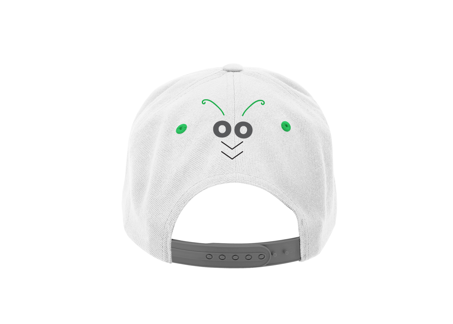
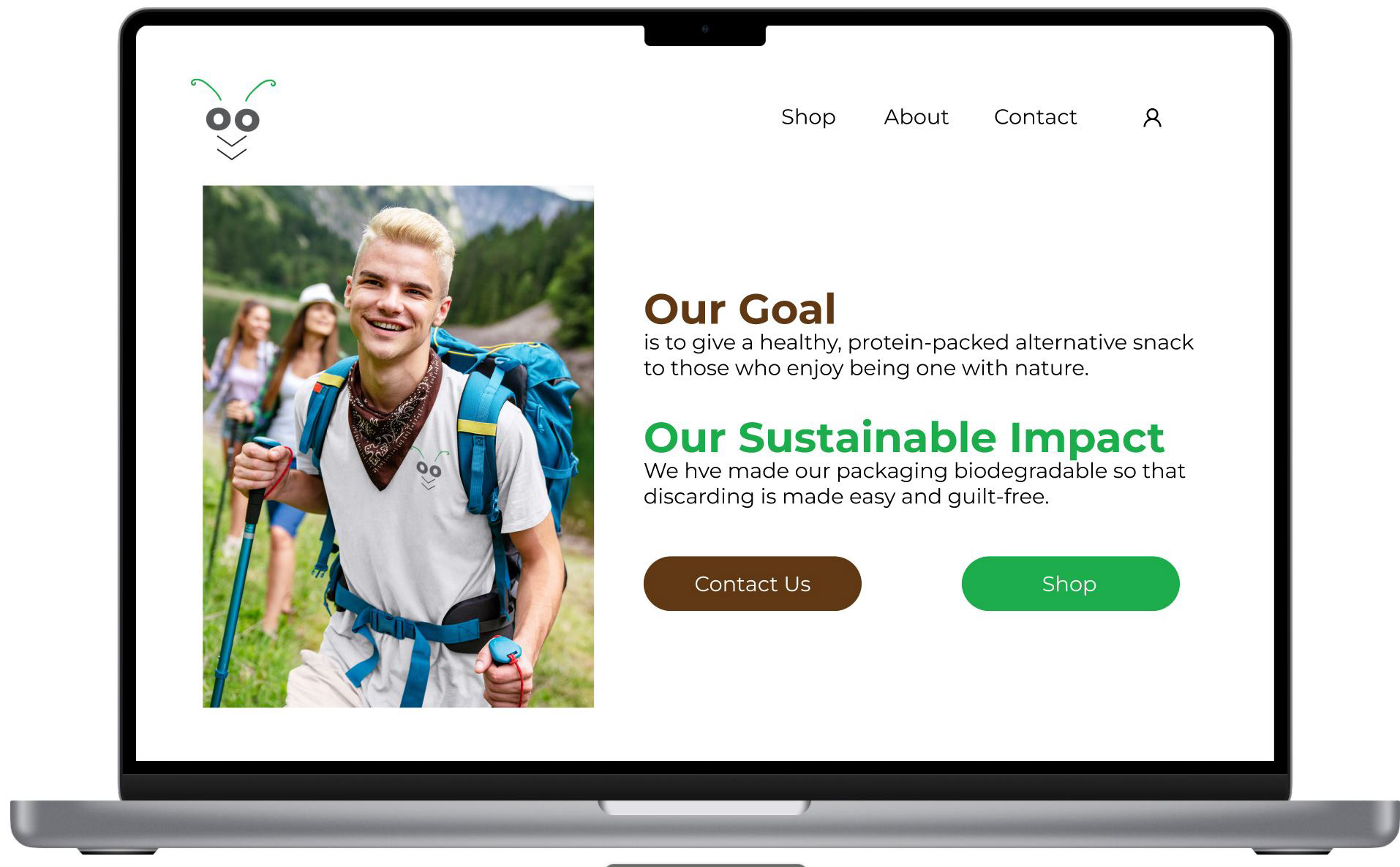
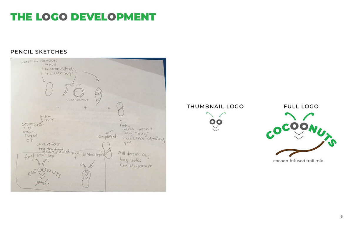
Cocoonuts is a cocoon-infused trail mix that I designed. Inspired by my sense of humor, I cleverly combined the word "cocoon" with "coconuts," which also has the word "nuts" in it, to make the brand name obvious and playful. This logo and brand was made to be clean, sophisticated, and modernly appealing to people with a healthy and environmentally conscious lifestyle, despite the contents of the product containing insects for public consumption.
Mock-up is made of colorfully inked printed paper. Logos for other products similar to the original mix were also created under the brand and were given similar names. Ideally, if the product was real, it would be made of decomposable paper that would be sealed with heat so that eating on-the-go would be safe to dispose anywhere, including while taking a stroll on the beautiful grounds of nature. Convenient, healthy, and eco-friendly.
If Cocoonuts had a website, the user interface (or UI) would probably look something like this. I made this motion-graphic mockup with Adobe After Effects. The animations would be coded using JavaScript.
Designed billboards and merchandise related to nature and having a positive and healthy conscious. Merchandise includes Hydroflask water bottles with the Cocoonuts logo on it, carbines to secure the snack bag or to safely and conveniently backpack items, an official Cocoonuts cap, and an official Cocoonuts drawstring bag. Check out the graphic standard below to see all the merchandise designs!
I presented the graphic standard to my class and to my professor, which detailed the mission statement, sibling products, color palette, fonts, business system material, rights, proper and improper uses of the logo, marketing material, and merchandise. This PDF also explains the design process of my logo.
The process manual was made on InDesign, which I printed out and submitted to my professor. Click below to view the digital version.